Academic Research Poster Design Blog
  • Design Tips
  • Design Blog
  • Poster Gallery
  • Video Tutorials
  • Helpful Links

Upcoming Trends in the World of Academic Research Poster Presentations

10/22/2016

1 Comment

 
Research posters have been around for a long time. This short piece goes over some of the new developments in the world of research poster presenting that you will want to be aware of if you plan on presenting a poster at an upcoming conference anytime soon. Not only has technology allowed for the development of novel research dissemination methods but they have also contributed to the evolution of today’s research poster presentation session compared to say a decade ago.
Picture
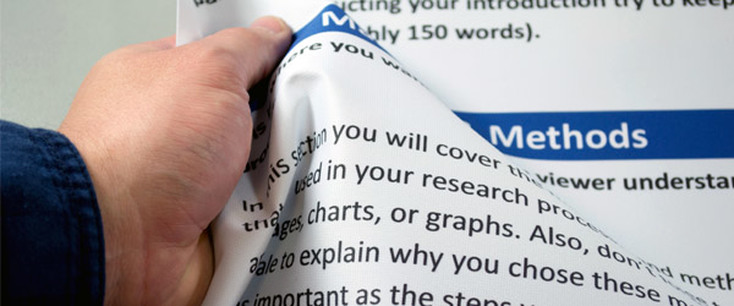
Paper posters are slowly becoming a thing of the past being replaced by much more durable fabric posters or by electronic posters. PosterSession.com and PosterPresentations.com both provide online poster printing services and print posters in fabric. While fabric costs more than paper, about $120 compared to around half of that for paper, the extra expense for a carrying case if travelling with the poster almost evens it out across the board.
Picture
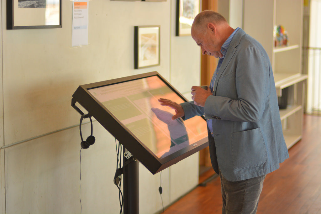
Electronic versions of research posters are emerging all over the world but no one has made as much progress as iPosterSessions.com by aMuze! Interactive which provides a truly electronic interactive research dissemination equipment that can be rented out for use at large conferences.
Picture
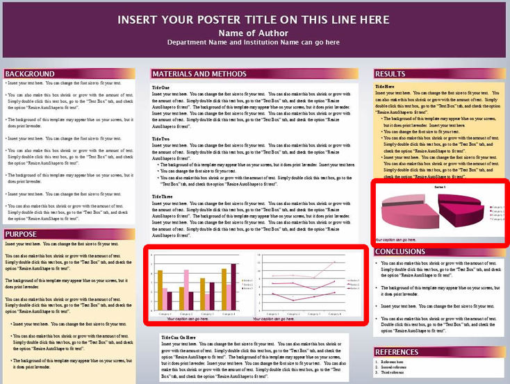
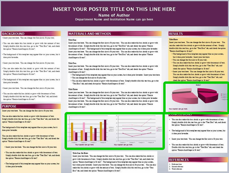
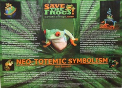
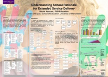
Above all creativity and innovative ideas seem to be leading the way when it comes to research poster presentations. The old tradition of using a Power Point template is no longer the norm as researcher’s are finding that the way to stick out from the crowd is to design a unique, one of a kind poster.
1 Comment

How to Market Your Research Poster Before the Conference and How to Share It Afterwards

7/10/2016

1 Comment

 
Follow @academicposter
Why do we invest countless hours into making and presenting academic posters?

This is a question that you‘ve probably asked and hopefully, have answered for yourself before launching into your poster-making mission. Likely, you want your poster to be a hit with conference attendees and perhaps you even want to win the poster contest. Ultimately, you want to disseminate your research and to share your work to with everyone at the conference. Obviously, a nice-looking poster will help you achieve all of these things. Developing an attractive poster is what all of my other blog posts are intended to help you do. This post focuses on critical strategies to use to market your poster presentation and get the most out of the experience as possible. You never know, the networking opportunities that arise from your poster presentation could serve as a key that opens the door to your professional future!

You shouldn’t be surprised to hear that social media has become one of the best ways to share your research with the largest number of individuals in your field. Everyday an increasing number people involved in academic research become social media users. This may not be welcome news if you have little or no social media experience. But do not fret, Mark Carrigan has published an entire social media guide specifically for academics, making it easier for you to acquire the social media skills you need. If you still need convincing, SciLogs features an article with ten very compelling reasons to jump on the social media band wagon. Presently, Twitter and Facebook are the most popular social media platforms used by academics to share their work with thousands. Back in March 2016, the Guardian published a list of the top social media accounts for academics to follow.  

Here is my list of top social media academics who are actual researchers in their fields that have a good number of followers:
  1. @ProfTimLang
  2. @ProfTinyiko
  3. @hannahrudman
  4. Cecile Tamura – Facebook Page
  5. Talal Saint-Lôt – my own Academia.edu profile
 
In my professional opinion, Twitter is the best way to market your poster presentation. Most conferences have started using a #hashtag for attendees to use when posting to social media sites. Always make sure to include the conference hashtag and @youruniversity in posts that mention interesting findings about your research, where and when you will be presenting, and photos of your poster for even better effect. Usually @youruniversity will re-tweet these posts which would then expose your research to all of their followers at which point someone else may re-tweet and so on and so on. Also, include your twitter handle on your poster author information so that others who take pictures of it can include it in their posts. Many conference attendees with large Twitter followings will post photos of research posters, tagging whomever they can but usually having to spell out the author’s name instead of tagging them because they do not have Twitter accounts!? Don’t let this happen to you.
 
So what happens after the conference? Twitter is great for real-time networking during a conference but after the event you will find your energy is better invested in dedicated academic social media sites. Academic social media platforms are growing in popularity, mostly due to their high visibility in Google searches. These platforms present excellent opportunities to share your research with internet users around the world. If you are involved in very specialized cutting-edge research and want to identify potential collaborators, here are two platforms that will provide you the reach you may need. I have a few papers on Academia.edu that get viewed at least once a week by someone across the world and I know this because Academia.edu sends email notifications every time someone has access your paper.

Academia.edu: Coined the “Facebook for researchers”, this platform boasts advanced sharing tools such as the ability to upload poster drafts for reviewer comments from the public or groups. 39,142,978 academics have signed up to Academia.edu, adding 13,416,944 papers and 1,888,024 research interests. Academia.edu attracts over 36 million unique visitors a month.
Picture
ResearchGate: Founded in 2008 by physicians Dr. Ijad Madisch and Dr. Sören Hofmayer, and computer scientist Horst Fickenscher, ResearchGate today has more than 10 million members.
Picture
By posting your poster and paper on Academia.edu and ResearchGate, you provide permanent access by the internet public to your research. Creating an entire new universe of networking possibilities are into the future!
1 Comment

3 Hacks for Perfect Poster Colors

6/6/2016

1 Comment

 
Picture
As daunting as it is, everyone has to do it. But picking the colors to use for your poster shouldn’t be such a grueling experience. I’m going to share three ways that will make the process painless and simple for you. But before I do that I want to share some general guidelines that may help you use any of the three methods described below.

​Keeping it simple to two to four colors is best. Using different shades of the same color is always pleasant and a safe way out of the conundrum. But those that really want to impress, adding distinctive color contrast to your poster will help it stick out even more. Use color in images, graphs, diagrams and to highlight different sections of your poster. Try not to use different colors in your text, instead use text modifications like bold and italics to emphasize which information is more or less important.

​1. Base Your Choice on Color Theory

Color theory involves the color wheel, color value, and color scheme. I’m going to only focus on the theory behind the color scheme but if you want to learn more feel free to click on the link at the end of this article. Below I've listed several types of color schemes based on the color wheel and also included a couple based on the psychology of color. After understanding these theories you can apply either of the next two methods to digitally generate your color scheme or palette based on whichever theory you would like to implement.
​Monochromatic scheme – One color and that color’s various shades and tints
Picture
​Analogous colors – Colors that are next to each other on the color wheel.  When used as a color scheme, analogous colors can be dramatic.
Picture
​Complementary colors- Colors located directly across from each other on the color wheel.  Complementary color scheme provide strong contrast.
Picture
​Color triads – Consist of three colors found on the color wheel that are equally spaced apart from each other.
Picture
​Split complementary – Color schemes are made up of a color and that color’s complements closest analogous colors.
Picture
​Warm colors – Colors that are usually associated with warm things.  Ex. Red, yellow, orange
Picture
​Cool colors – Colors that are usually associated with cool things.  Ex. Blue, purple, green
Picture
Visit TheVirtualInstructor.com for more in depth article

​2. Color Scheme Generators

Why trust your eye when you can rely on a computer to do it for you? There are tons of online color scheme generating websites and I hate re-duplicating work that has been done already. So instead of listing all of the actual online tools I’m going to list four of the best websites that have already done the work. Each website includes descriptive linked lists of color scheme generator tools. Some of them will overlap but together they cover more than thirty potential websites you can use to generate your next color scheme. 
  • Creative Bloq – 28 Tools for Creating Choosing a Color Scheme
  • Design Shack - 25 Awesome Tools for Choosing a Website Color Scheme
  • WebDesignLedger – 10 Super Useful Tools for Choosing the Right Color Palette
  • Bootstrapbay - 7 Color Scheme Generators to Help Pick the Perfect Palette

​3. Color Scheme Derived from a Photo

If you absolutely must include a certain image on your poster that is central to your topic, then deriving a color scheme based on colors in that image will make a lot of sense. Even better, use the image as your posters background so that it not only sets up your color scheme but also the overall format. Click here to learn how to use an image as a background. Below are four of the best websites I found to pull colors from a picture.
  • CSSDrive – Able to upload an image or copy/paste URLs
  • Pictaculous – Only upload images
  • PalleteGenerator – Only upload images
  • DaGreave – Only copy/paste URLs
1 Comment

How Big Should My Title Be?

5/23/2016

1 Comment

 
A simple font size should answer this question, right? WRONG! A font range of about 75 – 150 point might be helpful but to really understand how large your title should be you are going to have to learn a principle of design that is often taught in art or photography school, the principle of dominance.

What is the first thing you expect viewers to see when they look at your poster? In most cases, it’s your title. This means your title must dominate the other elements on your poster. If you compare any two elements on a poster they will be equal or one will exert dominance over the other. The most dominant element will attract a viewer’s gaze and will be the first thing they notice. The more dominant an element is compared to the others the more force it will seem to exert on the other elements.

Your poster will contain several elements which are either dominant, sub-dominant, or subordinate. The trick is to use the art of dominance to tell your research story in a way that the most important parts of your story dominate the other less important parts. So how do you create dominance? You increase the element’s visual weight.

The most common mistake in research poster design is to have two dominant elements that compete for the viewer’s attention. In these cases the title is usually competing with the text underneath it, the author’s name and contact information. Hands down, from a viewer’s point-of-view the title and topic of a poster are the most important elements of information they want to know. The author’s name is rarely essential to understanding any part of the research story at all. So making the author’s name/info a sub-dominant or even subordinate element keeps it from competing with other more important and relevant information.

Here are ways you can increase an element’s visual weight:
  • size
  • shape
  • color
  • value
  • depth
  • texture
  • density
  • saturation
  • orientation
  • local blank space
  • intrinsic interest
  • perceived physical weight

​In most cases, your poster’s title should have the greatest visual weight and attract the viewer’s eye first. It is how your poster starts off its research story and should start the conversation with viewers. The title should emphasize the most important information on your poster and should set the context for what’s seen next. Your take away message should be clearly communicated in or near your dominant element.

​Of course, there are always exceptions to the rule. Sometimes the poster title isn’t the most important or effective way of communicating the topic of your poster. Instead, using an image as the dominant element ends up working much better. By using an image you can nail the first impression and attract a viewer’s gaze right away, convincing them to walk up to your poster to learn more.
Picture
Example of TITLE competing with SUBHEADINGS
Picture
Example of attractive, dominant TITLE with subordinate SUBTITLE that provides take away message
Picture
Example of using an image as dominant element along with complimentary TITLE
1 Comment

   3 Tricks To Decrease Word Count

5/17/2016

1 Comment

 
Posters with too much text have very low ‘viewing efficiency’. Viewing efficiency is the measure of how easy it is to see, read, and digest everything on an academic poster. Viewing efficiency is the critical factor that determines whether a conference attendee chooses to walk up to your poster or the poster next to it. Do not copy/paste text from your paper to your poster. A mix of graphs, charts, diagrams, and some text provide a more pleasurable viewing experience rather than reading word after word after word after word... you get it!

Imagine that you’ are sitting in a panel session at an academic conference. The session comes to and end, so you get up and follow the line people out of the back door of the cramped room into the grand lobby which has been filled withwhere research posters are setup on displayed on easels. Everywhere you look Tthere are posters in every direction. There are –so many of them you that you don’t know where to start. Remember, you only have 15 minutes before the next session starts. So you start looking for the poster that looks like it would take the least time to read. As a result, you start scanning for the poster that has the least text and would take the least time to read. You find one that has little the least text with intriguing graphs and images. You start there.


Read on to learn 3 tricks you can use to help keep your word count low and make your poster be the one that you would stop at increase your viewing efficiency.

1.

Bullet points are quick & easy to read

The greatest reward from using bullet points is freedom from sentences and paragraph structures. Remember, conference attendees will be walking and standingby not sitting, meaning they will not be prone to read paragraphs as if they might if they were reading a book while sitting in a more relaxed positionor in bed. Bullet points provide you the quickest and with the easiest most efficient way to transmit messages via text to the viewer.
 
Notice something about the two posters below? There are no sentences, no paragraphs. Everything is bullet points.
Picture
Picture

2.

300 to 500 words is the ideal range

Use Microsoft Word to check on your word count by copy/pasting the text into a Word document and then reading the number on the bottom left toolbar.
 
The two posters below are perfect examples of how too much text. This mistake can intimidate the reader and can actually keep someone from even reduce the number of guests who approaching the poster. Would you walk up to either of these two posters?
Picture
Picture

3.

Use Images & Logos Instead of Text

By using images and logos you are transmitting messages to your viewer without forcing them to read text. By providing a research story that is mixed withUsing images and text, you are able to tell a research story while you will be able to maximizing e the audience’s ir viewing experience and ability to absorb and process the information. Images and text should always compliment and build on one another, so try not to repeat the samebe redundant with the information with you present in images and text. 
 
The two posters below are excellent examples of how you can incorporate images, icons, and diagrams to make your research story a little more interesting intriguing than the one right next to it.
 
To learn more about how to get the right images learn how to do advanced google image search.
 
For  tips on how to make your graphs more appealing check out the 5 Principles for a Perfect Grap
Picture
Picture
1 Comment

5 Principles for the Perfect Bar Graph

5/6/2016

1 Comment

 
One general tip before going into the details, customizing graphs and charts in Microsoft Publisher is probably your best option because it provides a multitude of features that allow for customization of virtually every aspect of your graph or chart.

1. Succinct and Descriptive Graph Title

​The first thing someone will see when looking at a graph on your poster is the title. So having a descriptive title that encompasses the subject matter of the data will help the viewer frame the information you are presenting. A good title allows your audience to read, digest, and compartmentalize the information faster. Below are some examples of good titles.
Picture
Picture
Picture

2. Sort Your Data BEFORE Charting

​If your independent variable is 'time' then a chronological order makes obvious sense. However, if this isn’t the case, ordering your variables in descending order might make more sense rather than random placement.
Picture
Picture

3. Spacing Between Bars

​To make your graphs easier to read, leave a white space between your bars to help viewers quickly distinguish between variables and to help them compare across non-adjacent variables more easily. One great rule of thumb to follow is the 1:2 rule: the white space between bars should be half as wide as the bars themselves.
Picture

4. Clean Up the Axes

Typically, the independent variable goes on the x-axis and the dependent variable on the y-axis. This is a great general rule to follow, but when it comes to visual communication, sometimes traditional conventions need to be broken in order to achieve the ultimate goal of effective communication.

​Vertical or slanted text on a poster forces viewers to tilt their heads in a usually uncomfortable manner in order to read your graph. An easy way to avoid this is to switch axes like the example below.
Picture
Picture
Picture
Remember, always try to label your axes, especially if the variables are numbers. Visual symbols like the dollar sign $ or %  work well in this case. 

5. Modify Grid lines and Background Color

​To make your graph and poster visually attractive it is essential to make sure that the colors flow. Try to ensure that the eye is not distracted by objects that are not crucial. In order to  match the color of your graphs with your poster's color scheme, it is important to customize the graph using tools in Microsoft Publisher. Incorporating the same color scheme will help your poster flow, avoiding distractions from other important features information.

Microsoft Publisher allows you to modify all of these aspects of your graph. First the background default is usually set to showing grid lines behind the bars. In most cases you would want to remove these. 
Picture
​Another part of the background is the actual color fill. You may be working on  a poster with a colored background that isn't white. So when you place a graph with a white background it shows up as a white block on the poster making it stick out noticeably even though it may not even be that important to the poster's overall message. To avoid this make the background of the graph transparent by selecting "No fill". You will notice that the colored background of your poster is now the background of your graph since its transparent making it fit much nicer with the rest of the poster and not stick out as much. 
Picture
Picture
1 Comment

Say "No" to Power Point Templates

4/26/2016

7 Comments


Yes, there is an alternative to Power Point templates!

Everyone loves templates--I love templates! But when it comes to academic posters using a template is a sure way of blending in with the rest of the crowd and not getting noticed. The reason for this entire blog is to help you create a unique poster that turns heads and gets your research the maximum attention. So when it comes to academic posters, do away with the templates. What’s the alternative you ask? Let’s talk about Microsoft Publisher. Not many people have used this entry-level desktop publishing software but it has been available in high-end Microsoft software packages since 1997 and in Microsoft Office packages since the 2010 version. Because they are both Microsoft products that feature very similar tools in the same familiar Microsoft windows-style configuration, it’s a smooth transition from Power Point to Publisher.

Now I’m going to layout three reasons why Microsoft Power Point should NOT be used to create posters. First, the most obvious fact is that Power Point is a program designed to produce slide show presentations. It’s not designed to produce posters or print material of any kind. Therefore, the only way to create a poster through Power Point would be based off a pre-designed template in which the slide would have been modified to a certain width and height. As I mentioned before, being constrained to a certain size and layout severely limits your ability to tell your own research story in a creative way that will be distinguishable from others. After all everyone else is using Power Point, right? Second, the most difficult thing about using Microsoft Power Point for a poster is that if you have a computer with average processing speed, then navigating around the poster once it is populated with all of its elements can be slow and cumbersome because the software—again, the program simply is not designed for such large art boards with so many elements. The third, and potentially most important reason why you should avoid Power Point for projects involving printing is the fact that all colors produced in Power Point are based on the RGB color model, which is a system for representing colors to be used on a computer display. The CMYK color model is used for printing and is the color model printers are designed to interpret. Because of this, when using Power Point the colors you see in the program are not the same colors you get when you print it out. However, Microsoft Publisher is capable of producing both color wheel types and with this program you can be assured that the colors will match exactly when your poster is printed.

When trying to create a poster for your first time in Publisher the most difficult part  is actually getting the document opened in the program! Once you learn, you won’t forget how. Below is a step-by-step guide on how to get this done.

​Step 1: Click "More Blank Page Sizes"

Picture

Step 2: Click "Create New Page Size…"

Picture

Step 3: Set the dimensions of your poster

I typically use 48” width and 36” height. For size you should consider if you have to use a certain printer because then your poster dimensions are limited to the maximum width of the printer (often called a plotter). Also, if you will be travelling consider the extra 12” of tube you will have to manage if you decide to go with a 60” x 48” poster
Picture

Step 4: Open a New Size to create a blank poster document

After clicking "OK", a New Page Size icon will be created under the Custom tab with the dimensions you had entered. You can either double click this new icon or click "create" to open a blank poster document.
Picture

Step 5: Start working on your poster!

Picture
​Mac users will be disappointed to learn that Microsoft Publisher is not included in the Mac versions of Microsoft Office. So the only way to use Publisher on a Mac would be to configure a dual boot with a Windows operating system.
7 Comments

Advanced Google Image Search

4/19/2016

1 Comment

 
One of the worst things to ever experience is the deeply disappointing feeling after printing your poster only to find out your images came out blurry because they were not high enough resolution. Of course, you could have avoided this by reading this article. So consider yourself lucky and read on.

I’m going to explain how you can use a refined google image search that will help you find high resolution images that won’t print out blurry. You will also learn how to find pictures that match a certain color or that meet other specifications that may pertain to your particular needs, for example, you may need clip art instead of a photo.

​First, you need to go to google.com and type something into the search field. In this case I’m going to type in “elephant.” Right underneath the search box, click the “images” tab so that only images results are displayed. It should look like screenshot 1 below. You will notice a small cog in the upper right hand corner. Click it and then select ‘advanced search’ from the drop down menu.

​

Screenshot 1

Screenshot 1
​The advanced image search is the key to narrowing down your results to only images that you can use on your poster. In  screenshot 2 below, reference section 1 to refine your search with keywords.  The fields in section 2 can be used to refine characteristics such as size, aspect ratio, type of image, and color. The size option allows you to select between a variety of options but I usually select the 'large' option for images that I will use for my posters. To find a image with the right dimensions, use the 'aspect ratio' field to select between square, tall, wide, or panoramic images. Images that clash with your color scheme can kill your poster's vibe. Use the color field to refine your search to images that match the color you selected. If you prefer to use clip art or line drawings instead of photographs, use the 'type of image' field to toggle between various options.

As you can see in screenshot 2 below, I’ve selected large for size, square for aspect ratio, photo for type of image, and blue for color. Screen shot 3 below will show you the results.

​

Screenshot 2

Picture

Screenshot 3

Picture
​Now that you’ve perfected the google image search, let's address copyright laws and the use of google images on posters. This is simple. Copyright violations can be serious and using a copyrighted photo on a poster without permission is a violation, so make sure the image you find is not copyrighted. If you are not sure, contact the webmaster or content owner. Good luck on your search.
1 Comment

Nail the First Impression

4/17/2016

0 Comments


What do the three posters below have in common?

Picture
Picture
Picture

It may have taken you a minute or two, but I'm sure you noticed that all three posters above use a photo as a background instead of the traditional white or colored space background that is typically used on posters. As you can see, it’s a great way to add a visual component to your poster but it also increases what I like to call the 'viewing efficiency'. Viewing efficiency is the measure of how easy it is to see, read, and digest everything on an academic poster. Viewing efficiency is the critical factor that determines whether a conference attendee chooses to walk up to your poster or the poster next to it. By adding an image as the background of your poster, you can achieve multiple objectives with a single technique. Let me explain how this works.

Let's look at the poster with the frog on it. The frog is the first thing you see even before you read the title.  You know this poster is about frogs before you read the content. In fact, even if you did read the title it probably doesn’t help much. This author did an excellent job of making it easier for her/his audience to understand their topic by communicating with an image instead of forcing you to read into the poster. Not only do you know that this poster is about frogs, but if it was displayed in an exhibit hall, surrounded by a sea of text-laden posters with shaded columns, you’d probably walk up to this one first. This is because 90% of the information we process is visual while the other 10% comes from the other four senses. Humans can process visual information 60,000 times faster than written text. Researchers report that the average human attention span is less than a goldfish and has decreased from 12 seconds in 2000 to 8 seconds in 2013.
​
Remember, conference attendees want to see your research, not read it.

0 Comments
    Picture
    View my profile on LinkedIn

    Author

    Talal
    Poster Design Consultant

    Archives

    October 2016
    July 2016
    June 2016
    May 2016
    April 2016

    Categories

    All
    Advanced Google Image Search
    Google Image Search
    Image Search
    Poster Images
    Poster Photos

    RSS Feed

Menu

Free Guide
Design Tips
Templates
Gallery
Helpful Links
© COPYRIGHT 2016. ALL RIGHTS RESERVED.
  • Design Tips
  • Design Blog
  • Poster Gallery
  • Video Tutorials
  • Helpful Links