Posters with too much text have very low ‘viewing efficiency’. Viewing efficiency is the measure of how easy it is to see, read, and digest everything on an academic poster. Viewing efficiency is the critical factor that determines whether a conference attendee chooses to walk up to your poster or the poster next to it. Do not copy/paste text from your paper to your poster. A mix of graphs, charts, diagrams, and some text provide a more pleasurable viewing experience rather than reading word after word after word after word... you get it!
Imagine that you’ are sitting in a panel session at an academic conference. The session comes to and end, so you get up and follow the line people out of the back door of the cramped room into the grand lobby which has been filled withwhere research posters are setup on displayed on easels. Everywhere you look Tthere are posters in every direction. There are –so many of them you that you don’t know where to start. Remember, you only have 15 minutes before the next session starts. So you start looking for the poster that looks like it would take the least time to read. As a result, you start scanning for the poster that has the least text and would take the least time to read. You find one that has little the least text with intriguing graphs and images. You start there.
Read on to learn 3 tricks you can use to help keep your word count low and make your poster be the one that you would stop at increase your viewing efficiency.
1. | Bullet points are quick & easy to read |
The greatest reward from using bullet points is freedom from sentences and paragraph structures. Remember, conference attendees will be walking and standingby not sitting, meaning they will not be prone to read paragraphs as if they might if they were reading a book while sitting in a more relaxed positionor in bed. Bullet points provide you the quickest and with the easiest most efficient way to transmit messages via text to the viewer.
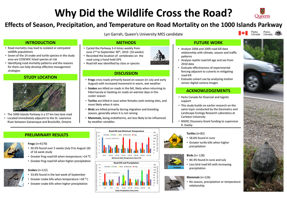
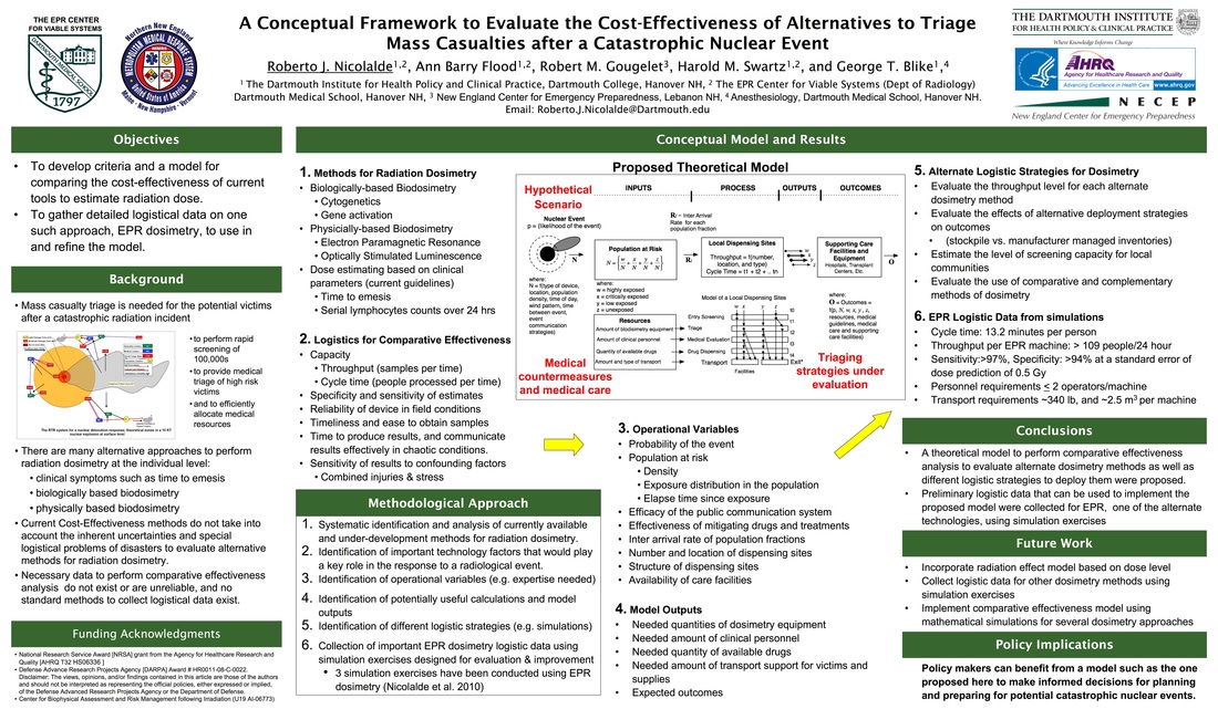
Notice something about the two posters below? There are no sentences, no paragraphs. Everything is bullet points.
Notice something about the two posters below? There are no sentences, no paragraphs. Everything is bullet points.
2. | 300 to 500 words is the ideal range |
Use Microsoft Word to check on your word count by copy/pasting the text into a Word document and then reading the number on the bottom left toolbar.
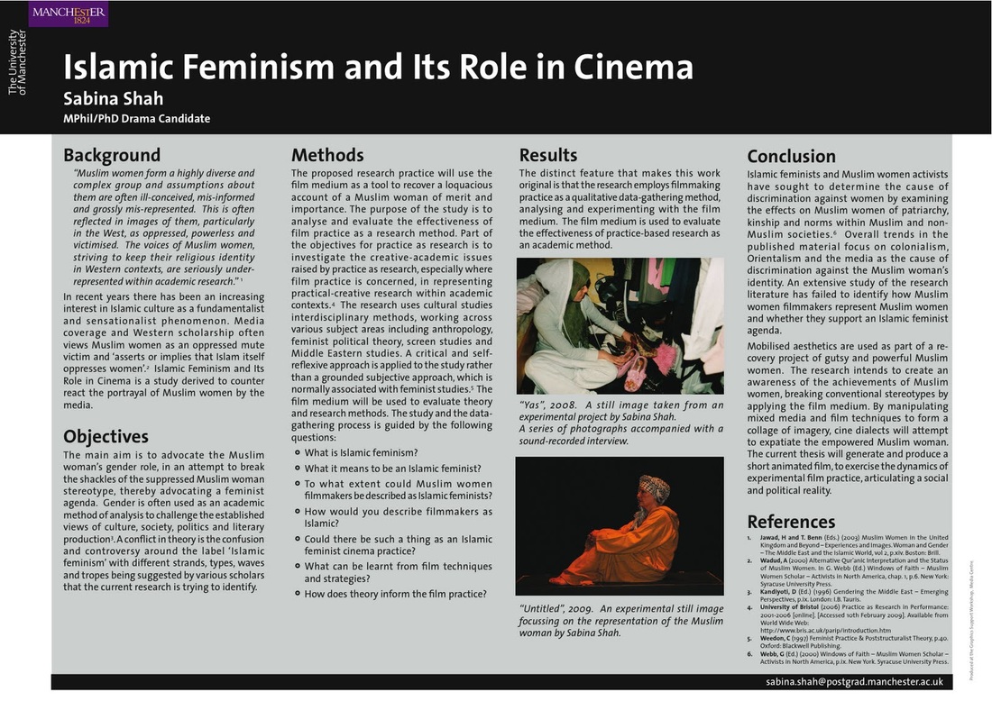
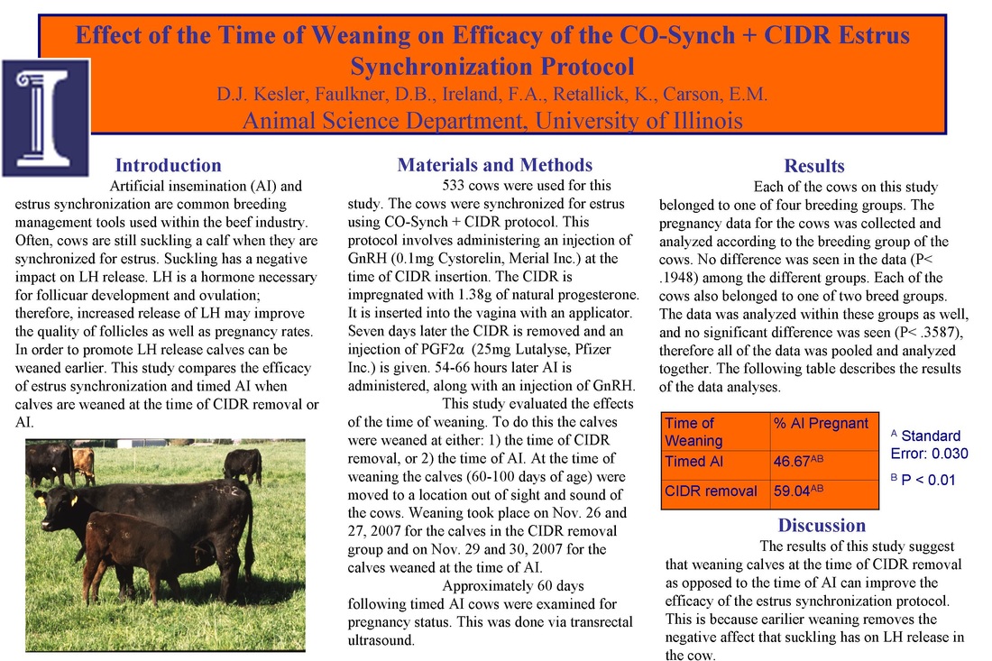
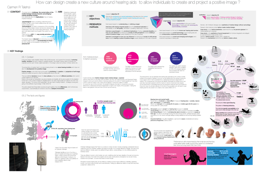
The two posters below are perfect examples of how too much text. This mistake can intimidate the reader and can actually keep someone from even reduce the number of guests who approaching the poster. Would you walk up to either of these two posters?
The two posters below are perfect examples of how too much text. This mistake can intimidate the reader and can actually keep someone from even reduce the number of guests who approaching the poster. Would you walk up to either of these two posters?
3. | Use Images & Logos Instead of Text |
By using images and logos you are transmitting messages to your viewer without forcing them to read text. By providing a research story that is mixed withUsing images and text, you are able to tell a research story while you will be able to maximizing e the audience’s ir viewing experience and ability to absorb and process the information. Images and text should always compliment and build on one another, so try not to repeat the samebe redundant with the information with you present in images and text.
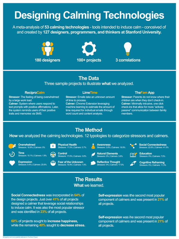
The two posters below are excellent examples of how you can incorporate images, icons, and diagrams to make your research story a little more interesting intriguing than the one right next to it.
To learn more about how to get the right images learn how to do advanced google image search.
For tips on how to make your graphs more appealing check out the 5 Principles for a Perfect Grap


 RSS Feed