Want to design a poster like one above?
Learn the tricks to successful poster design by reading below...
1. |
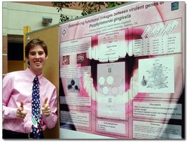
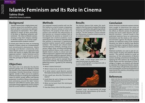
Nail the First ImpressionIncrease the 'viewing efficiency' of your poster. Viewing efficiency is the critical factor that determines whether a conference attendee chooses to walk up to your poster or the poster next to it. Learn how to use an image for the background of your poster to attract viewers from afar and make a lasting first impression in the conference exhibit hall.
|
|
2. |
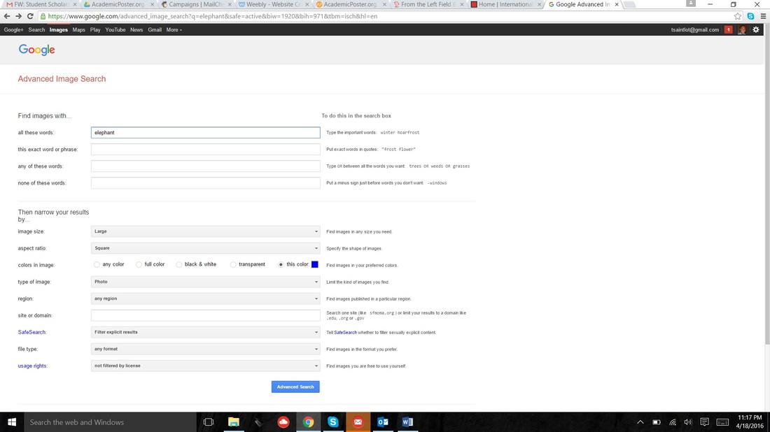
Advanced Google Image SearchFind out how to use a refined google image search to help you find high resolution images that won’t print out blurry on your poster. Also, learn how to find pictures that match a certain color or that meet other specifications that may pertain to your particular needs, for example, you may need clip art instead of a photo.
|
|
3. |
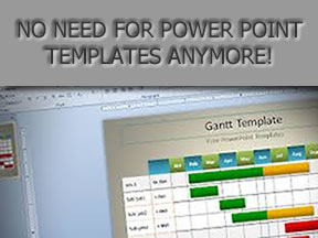
Say "No" to Power Point TemplatesYes, there is an alternative to Power Point templates! Discover how to use Microsoft Publisher to create your next research poster. Because they are both Microsoft products that feature very similar tools in the same familiar Microsoft windows-style configuration, it’s a smooth transition from Power Point to Publisher.
Check out the video tutorial on How to Get a Poster Started in Publisher |
|
4. |
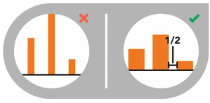
5 Principles for a Perfect Bar GraphGraphs and other illustrations are key to communicating your research in a visual way since almost all research involves some sort numerical data. One general tip before going into the details, customizing graphs and charts in Microsoft Publisher is probably your best option because it provides a multitude of features that allow for customization of virtually every aspect of your graph or chart so that it fits in perfectly with the rest of your content.
|
|
5. |
3 Tricks to Decrease Word CountThe most common mistake when creating research posters is TOO MANY WORDS! This post shares three tricks to help you reduce text and make your poster look much more inviting during a conference poster session. Like the title suggests, no one wants to read your poster, after all that's what your paper is for, instead they want to see your research. So show it to them.
|
|
6. |
How Big Should My Title Be?A simple font size should answer this question, right? WRONG! A font range of about 75 – 150 point might be helpful but to really understand how large your title should be you are going to have to learn a principle of design that is often taught in art or photography school, the principle of dominance.
|

|
7. |
3 Hacks for Perfect Poster ColorsAs daunting as it is, everyone has to do it. But picking the colors to use for your poster shouldn’t be such a grueling experience. I’m going to share three ways that will make the process painless and simple for you.
|

|
8. |
Get the MOST Out of Your Poster
|
|