Academic Research Poster Design Blog
  • Design Tips
  • Design Blog
  • Poster Gallery
  • Video Tutorials
  • Helpful Links

How Big Should My Title Be?

5/23/2016

1 Comment

 
A simple font size should answer this question, right? WRONG! A font range of about 75 – 150 point might be helpful but to really understand how large your title should be you are going to have to learn a principle of design that is often taught in art or photography school, the principle of dominance.

What is the first thing you expect viewers to see when they look at your poster? In most cases, it’s your title. This means your title must dominate the other elements on your poster. If you compare any two elements on a poster they will be equal or one will exert dominance over the other. The most dominant element will attract a viewer’s gaze and will be the first thing they notice. The more dominant an element is compared to the others the more force it will seem to exert on the other elements.

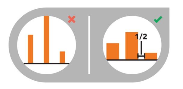
Your poster will contain several elements which are either dominant, sub-dominant, or subordinate. The trick is to use the art of dominance to tell your research story in a way that the most important parts of your story dominate the other less important parts. So how do you create dominance? You increase the element’s visual weight.

The most common mistake in research poster design is to have two dominant elements that compete for the viewer’s attention. In these cases the title is usually competing with the text underneath it, the author’s name and contact information. Hands down, from a viewer’s point-of-view the title and topic of a poster are the most important elements of information they want to know. The author’s name is rarely essential to understanding any part of the research story at all. So making the author’s name/info a sub-dominant or even subordinate element keeps it from competing with other more important and relevant information.

Here are ways you can increase an element’s visual weight:
  • size
  • shape
  • color
  • value
  • depth
  • texture
  • density
  • saturation
  • orientation
  • local blank space
  • intrinsic interest
  • perceived physical weight

​In most cases, your poster’s title should have the greatest visual weight and attract the viewer’s eye first. It is how your poster starts off its research story and should start the conversation with viewers. The title should emphasize the most important information on your poster and should set the context for what’s seen next. Your take away message should be clearly communicated in or near your dominant element.

​Of course, there are always exceptions to the rule. Sometimes the poster title isn’t the most important or effective way of communicating the topic of your poster. Instead, using an image as the dominant element ends up working much better. By using an image you can nail the first impression and attract a viewer’s gaze right away, convincing them to walk up to your poster to learn more.
Picture
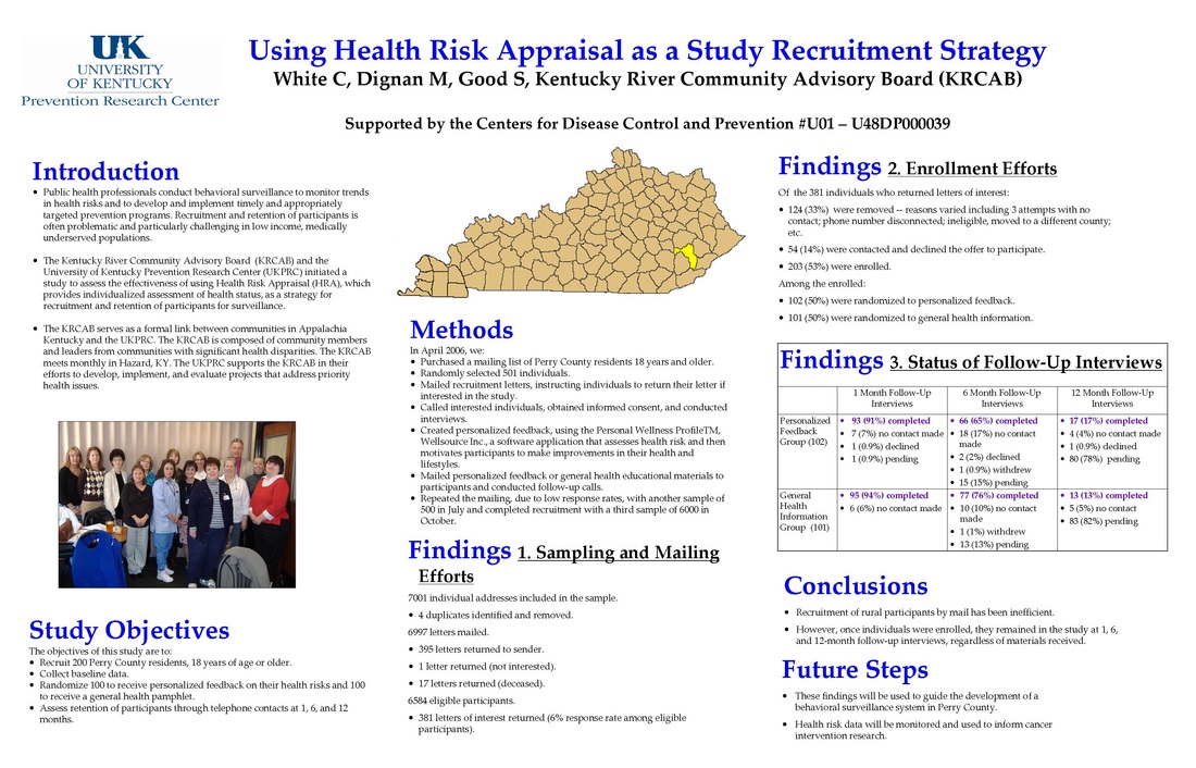
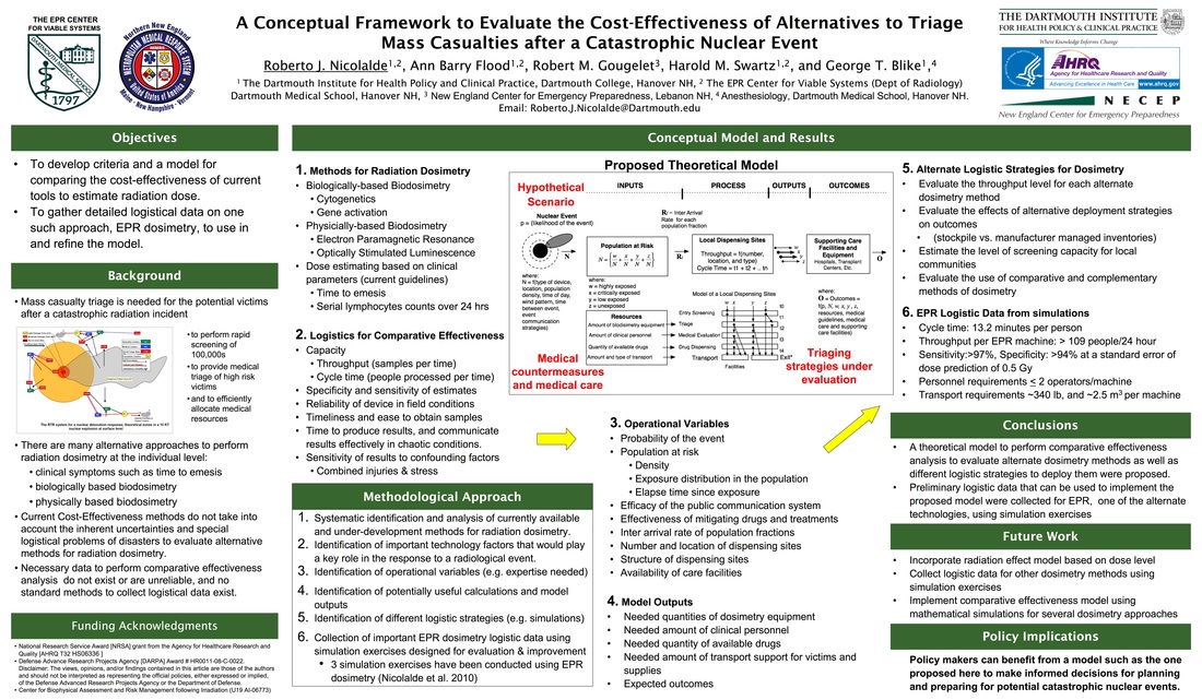
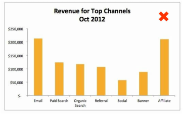
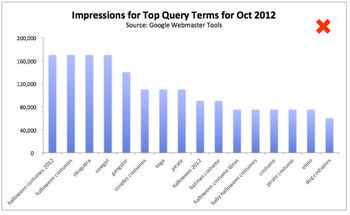
Example of TITLE competing with SUBHEADINGS
Picture
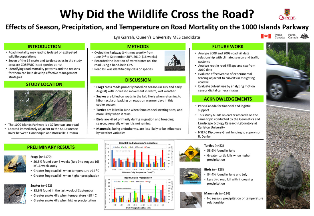
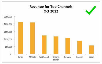
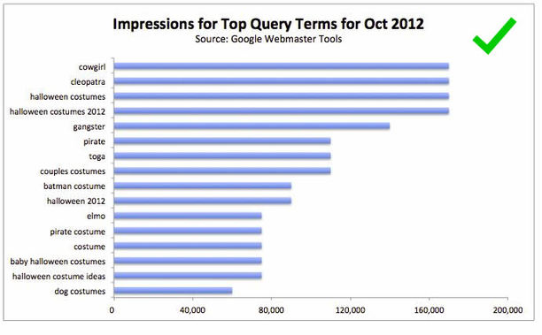
Example of attractive, dominant TITLE with subordinate SUBTITLE that provides take away message
Picture
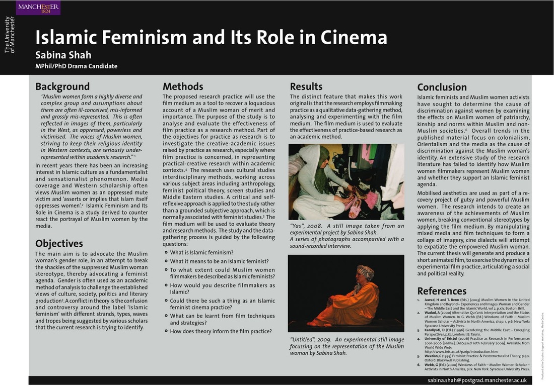
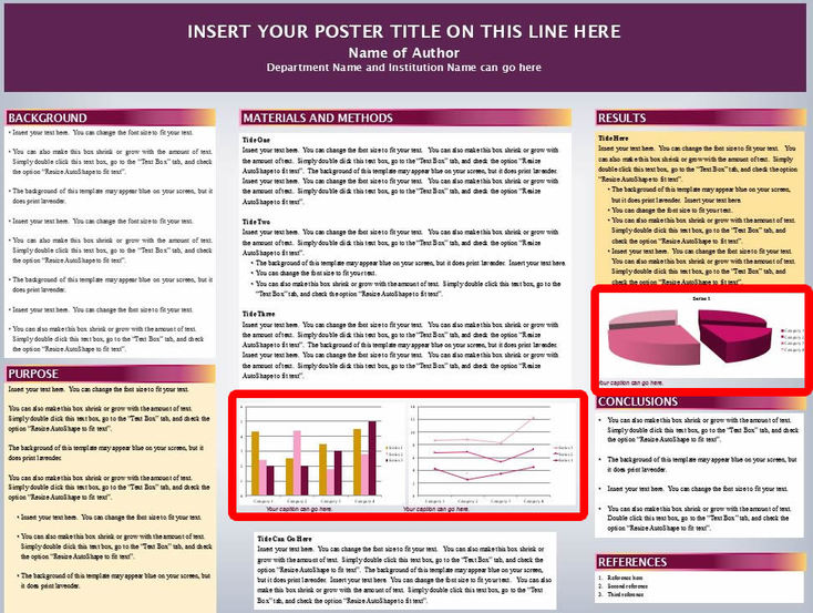
Example of using an image as dominant element along with complimentary TITLE
1 Comment

   3 Tricks To Decrease Word Count

5/17/2016

1 Comment

 
Posters with too much text have very low ‘viewing efficiency’. Viewing efficiency is the measure of how easy it is to see, read, and digest everything on an academic poster. Viewing efficiency is the critical factor that determines whether a conference attendee chooses to walk up to your poster or the poster next to it. Do not copy/paste text from your paper to your poster. A mix of graphs, charts, diagrams, and some text provide a more pleasurable viewing experience rather than reading word after word after word after word... you get it!

Imagine that you’ are sitting in a panel session at an academic conference. The session comes to and end, so you get up and follow the line people out of the back door of the cramped room into the grand lobby which has been filled withwhere research posters are setup on displayed on easels. Everywhere you look Tthere are posters in every direction. There are –so many of them you that you don’t know where to start. Remember, you only have 15 minutes before the next session starts. So you start looking for the poster that looks like it would take the least time to read. As a result, you start scanning for the poster that has the least text and would take the least time to read. You find one that has little the least text with intriguing graphs and images. You start there.


Read on to learn 3 tricks you can use to help keep your word count low and make your poster be the one that you would stop at increase your viewing efficiency.

1.

Bullet points are quick & easy to read

The greatest reward from using bullet points is freedom from sentences and paragraph structures. Remember, conference attendees will be walking and standingby not sitting, meaning they will not be prone to read paragraphs as if they might if they were reading a book while sitting in a more relaxed positionor in bed. Bullet points provide you the quickest and with the easiest most efficient way to transmit messages via text to the viewer.
 
Notice something about the two posters below? There are no sentences, no paragraphs. Everything is bullet points.
Picture
Picture

2.

300 to 500 words is the ideal range

Use Microsoft Word to check on your word count by copy/pasting the text into a Word document and then reading the number on the bottom left toolbar.
 
The two posters below are perfect examples of how too much text. This mistake can intimidate the reader and can actually keep someone from even reduce the number of guests who approaching the poster. Would you walk up to either of these two posters?
Picture
Picture

3.

Use Images & Logos Instead of Text

By using images and logos you are transmitting messages to your viewer without forcing them to read text. By providing a research story that is mixed withUsing images and text, you are able to tell a research story while you will be able to maximizing e the audience’s ir viewing experience and ability to absorb and process the information. Images and text should always compliment and build on one another, so try not to repeat the samebe redundant with the information with you present in images and text. 
 
The two posters below are excellent examples of how you can incorporate images, icons, and diagrams to make your research story a little more interesting intriguing than the one right next to it.
 
To learn more about how to get the right images learn how to do advanced google image search.
 
For  tips on how to make your graphs more appealing check out the 5 Principles for a Perfect Grap
Picture
Picture
1 Comment

5 Principles for the Perfect Bar Graph

5/6/2016

1 Comment

 
One general tip before going into the details, customizing graphs and charts in Microsoft Publisher is probably your best option because it provides a multitude of features that allow for customization of virtually every aspect of your graph or chart.

1. Succinct and Descriptive Graph Title

​The first thing someone will see when looking at a graph on your poster is the title. So having a descriptive title that encompasses the subject matter of the data will help the viewer frame the information you are presenting. A good title allows your audience to read, digest, and compartmentalize the information faster. Below are some examples of good titles.
Picture
Picture
Picture

2. Sort Your Data BEFORE Charting

​If your independent variable is 'time' then a chronological order makes obvious sense. However, if this isn’t the case, ordering your variables in descending order might make more sense rather than random placement.
Picture
Picture

3. Spacing Between Bars

​To make your graphs easier to read, leave a white space between your bars to help viewers quickly distinguish between variables and to help them compare across non-adjacent variables more easily. One great rule of thumb to follow is the 1:2 rule: the white space between bars should be half as wide as the bars themselves.
Picture

4. Clean Up the Axes

Typically, the independent variable goes on the x-axis and the dependent variable on the y-axis. This is a great general rule to follow, but when it comes to visual communication, sometimes traditional conventions need to be broken in order to achieve the ultimate goal of effective communication.

​Vertical or slanted text on a poster forces viewers to tilt their heads in a usually uncomfortable manner in order to read your graph. An easy way to avoid this is to switch axes like the example below.
Picture
Picture
Picture
Remember, always try to label your axes, especially if the variables are numbers. Visual symbols like the dollar sign $ or %  work well in this case. 

5. Modify Grid lines and Background Color

​To make your graph and poster visually attractive it is essential to make sure that the colors flow. Try to ensure that the eye is not distracted by objects that are not crucial. In order to  match the color of your graphs with your poster's color scheme, it is important to customize the graph using tools in Microsoft Publisher. Incorporating the same color scheme will help your poster flow, avoiding distractions from other important features information.

Microsoft Publisher allows you to modify all of these aspects of your graph. First the background default is usually set to showing grid lines behind the bars. In most cases you would want to remove these. 
Picture
​Another part of the background is the actual color fill. You may be working on  a poster with a colored background that isn't white. So when you place a graph with a white background it shows up as a white block on the poster making it stick out noticeably even though it may not even be that important to the poster's overall message. To avoid this make the background of the graph transparent by selecting "No fill". You will notice that the colored background of your poster is now the background of your graph since its transparent making it fit much nicer with the rest of the poster and not stick out as much. 
Picture
Picture
1 Comment
    Picture
    View my profile on LinkedIn

    Author

    Talal
    Poster Design Consultant

    Archives

    October 2016
    July 2016
    June 2016
    May 2016
    April 2016

    Categories

    All
    Advanced Google Image Search
    Google Image Search
    Image Search
    Poster Images
    Poster Photos

    RSS Feed

Menu

Free Guide
Design Tips
Templates
Gallery
Helpful Links
© COPYRIGHT 2016. ALL RIGHTS RESERVED.
  • Design Tips
  • Design Blog
  • Poster Gallery
  • Video Tutorials
  • Helpful Links