Academic Research Poster Design Blog
  • Design Tips
  • Design Blog
  • Poster Gallery
  • Video Tutorials
  • Helpful Links

Say "No" to Power Point Templates

4/26/2016

253 Comments


Yes, there is an alternative to Power Point templates!

Everyone loves templates--I love templates! But when it comes to academic posters using a template is a sure way of blending in with the rest of the crowd and not getting noticed. The reason for this entire blog is to help you create a unique poster that turns heads and gets your research the maximum attention. So when it comes to academic posters, do away with the templates. What’s the alternative you ask? Let’s talk about Microsoft Publisher. Not many people have used this entry-level desktop publishing software but it has been available in high-end Microsoft software packages since 1997 and in Microsoft Office packages since the 2010 version. Because they are both Microsoft products that feature very similar tools in the same familiar Microsoft windows-style configuration, it’s a smooth transition from Power Point to Publisher.

Now I’m going to layout three reasons why Microsoft Power Point should NOT be used to create posters. First, the most obvious fact is that Power Point is a program designed to produce slide show presentations. It’s not designed to produce posters or print material of any kind. Therefore, the only way to create a poster through Power Point would be based off a pre-designed template in which the slide would have been modified to a certain width and height. As I mentioned before, being constrained to a certain size and layout severely limits your ability to tell your own research story in a creative way that will be distinguishable from others. After all everyone else is using Power Point, right? Second, the most difficult thing about using Microsoft Power Point for a poster is that if you have a computer with average processing speed, then navigating around the poster once it is populated with all of its elements can be slow and cumbersome because the software—again, the program simply is not designed for such large art boards with so many elements. The third, and potentially most important reason why you should avoid Power Point for projects involving printing is the fact that all colors produced in Power Point are based on the RGB color model, which is a system for representing colors to be used on a computer display. The CMYK color model is used for printing and is the color model printers are designed to interpret. Because of this, when using Power Point the colors you see in the program are not the same colors you get when you print it out. However, Microsoft Publisher is capable of producing both color wheel types and with this program you can be assured that the colors will match exactly when your poster is printed.

When trying to create a poster for your first time in Publisher the most difficult part  is actually getting the document opened in the program! Once you learn, you won’t forget how. Below is a step-by-step guide on how to get this done.

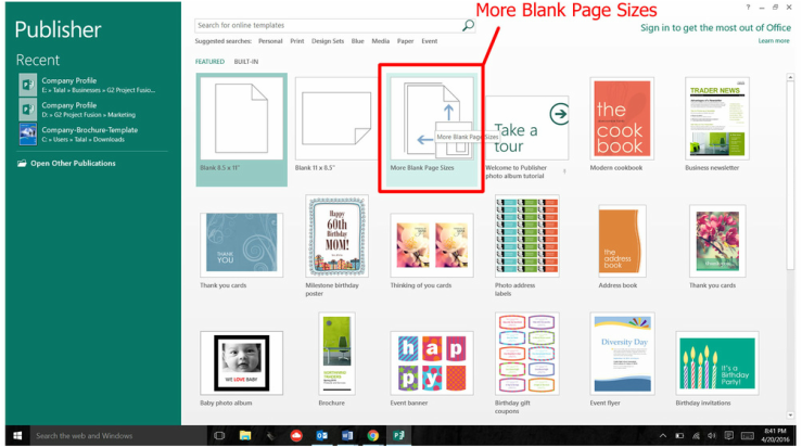
​Step 1: Click "More Blank Page Sizes"

Picture

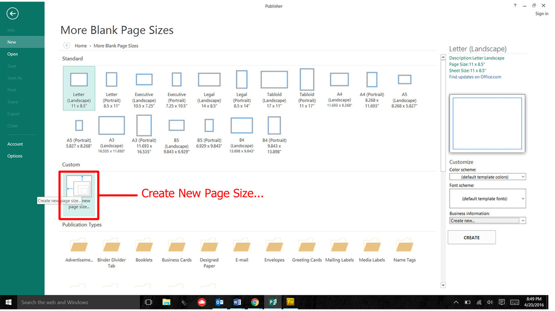
Step 2: Click "Create New Page Size…"

Picture

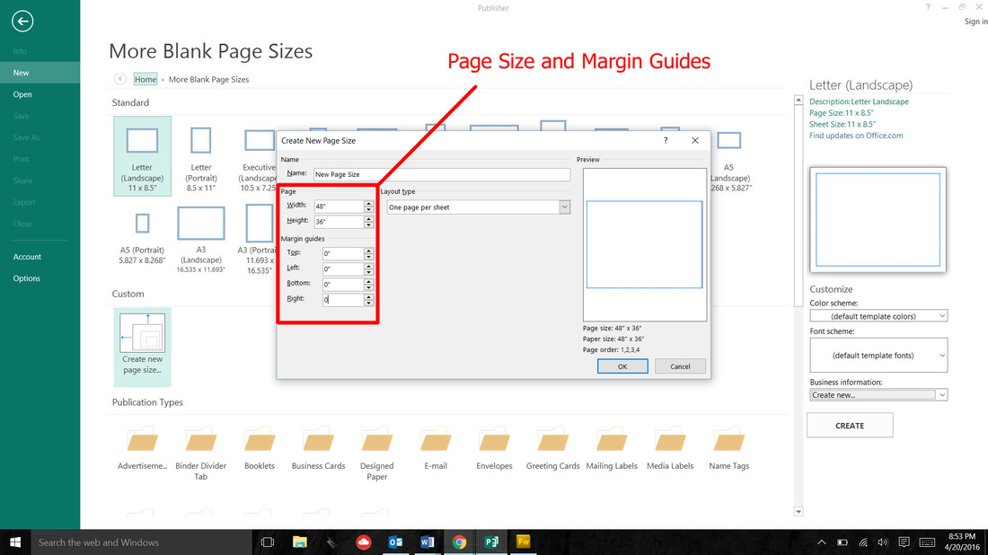
Step 3: Set the dimensions of your poster

I typically use 48” width and 36” height. For size you should consider if you have to use a certain printer because then your poster dimensions are limited to the maximum width of the printer (often called a plotter). Also, if you will be travelling consider the extra 12” of tube you will have to manage if you decide to go with a 60” x 48” poster
Picture

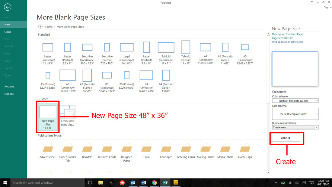
Step 4: Open a New Size to create a blank poster document

After clicking "OK", a New Page Size icon will be created under the Custom tab with the dimensions you had entered. You can either double click this new icon or click "create" to open a blank poster document.
Picture

Step 5: Start working on your poster!

Picture
​Mac users will be disappointed to learn that Microsoft Publisher is not included in the Mac versions of Microsoft Office. So the only way to use Publisher on a Mac would be to configure a dual boot with a Windows operating system.
253 Comments

Advanced Google Image Search

4/19/2016

3 Comments

 
One of the worst things to ever experience is the deeply disappointing feeling after printing your poster only to find out your images came out blurry because they were not high enough resolution. Of course, you could have avoided this by reading this article. So consider yourself lucky and read on.

I’m going to explain how you can use a refined google image search that will help you find high resolution images that won’t print out blurry. You will also learn how to find pictures that match a certain color or that meet other specifications that may pertain to your particular needs, for example, you may need clip art instead of a photo.

​First, you need to go to google.com and type something into the search field. In this case I’m going to type in “elephant.” Right underneath the search box, click the “images” tab so that only images results are displayed. It should look like screenshot 1 below. You will notice a small cog in the upper right hand corner. Click it and then select ‘advanced search’ from the drop down menu.

​

Screenshot 1

Screenshot 1
​The advanced image search is the key to narrowing down your results to only images that you can use on your poster. In  screenshot 2 below, reference section 1 to refine your search with keywords.  The fields in section 2 can be used to refine characteristics such as size, aspect ratio, type of image, and color. The size option allows you to select between a variety of options but I usually select the 'large' option for images that I will use for my posters. To find a image with the right dimensions, use the 'aspect ratio' field to select between square, tall, wide, or panoramic images. Images that clash with your color scheme can kill your poster's vibe. Use the color field to refine your search to images that match the color you selected. If you prefer to use clip art or line drawings instead of photographs, use the 'type of image' field to toggle between various options.

As you can see in screenshot 2 below, I’ve selected large for size, square for aspect ratio, photo for type of image, and blue for color. Screen shot 3 below will show you the results.

​

Screenshot 2

Picture

Screenshot 3

Picture
​Now that you’ve perfected the google image search, let's address copyright laws and the use of google images on posters. This is simple. Copyright violations can be serious and using a copyrighted photo on a poster without permission is a violation, so make sure the image you find is not copyrighted. If you are not sure, contact the webmaster or content owner. Good luck on your search.
3 Comments

Nail the First Impression

4/17/2016

0 Comments


What do the three posters below have in common?

Picture
Picture
Picture

It may have taken you a minute or two, but I'm sure you noticed that all three posters above use a photo as a background instead of the traditional white or colored space background that is typically used on posters. As you can see, it’s a great way to add a visual component to your poster but it also increases what I like to call the 'viewing efficiency'. Viewing efficiency is the measure of how easy it is to see, read, and digest everything on an academic poster. Viewing efficiency is the critical factor that determines whether a conference attendee chooses to walk up to your poster or the poster next to it. By adding an image as the background of your poster, you can achieve multiple objectives with a single technique. Let me explain how this works.

Let's look at the poster with the frog on it. The frog is the first thing you see even before you read the title.  You know this poster is about frogs before you read the content. In fact, even if you did read the title it probably doesn’t help much. This author did an excellent job of making it easier for her/his audience to understand their topic by communicating with an image instead of forcing you to read into the poster. Not only do you know that this poster is about frogs, but if it was displayed in an exhibit hall, surrounded by a sea of text-laden posters with shaded columns, you’d probably walk up to this one first. This is because 90% of the information we process is visual while the other 10% comes from the other four senses. Humans can process visual information 60,000 times faster than written text. Researchers report that the average human attention span is less than a goldfish and has decreased from 12 seconds in 2000 to 8 seconds in 2013.
​
Remember, conference attendees want to see your research, not read it.

0 Comments
    Picture
    View my profile on LinkedIn

    Author

    Talal
    Poster Design Consultant

    Archives

    October 2016
    July 2016
    June 2016
    May 2016
    April 2016

    Categories

    All
    Advanced Google Image Search
    Google Image Search
    Image Search
    Poster Images
    Poster Photos

    RSS Feed

Menu

Free Guide
Design Tips
Templates
Gallery
Helpful Links
© COPYRIGHT 2016. ALL RIGHTS RESERVED.
  • Design Tips
  • Design Blog
  • Poster Gallery
  • Video Tutorials
  • Helpful Links